Most public art briefs ask for something new. The brief for an aged care community quietly asks for the opposite: something remembered.
The question that started it
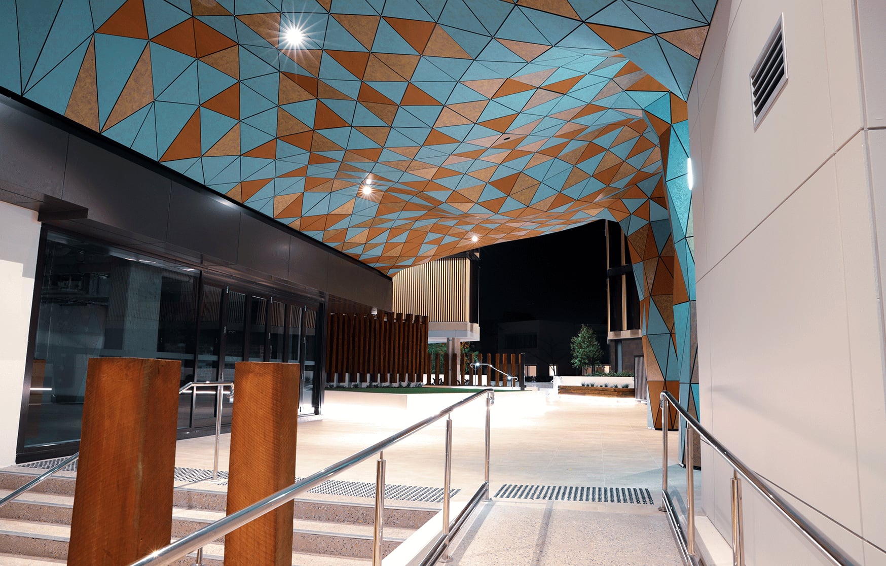
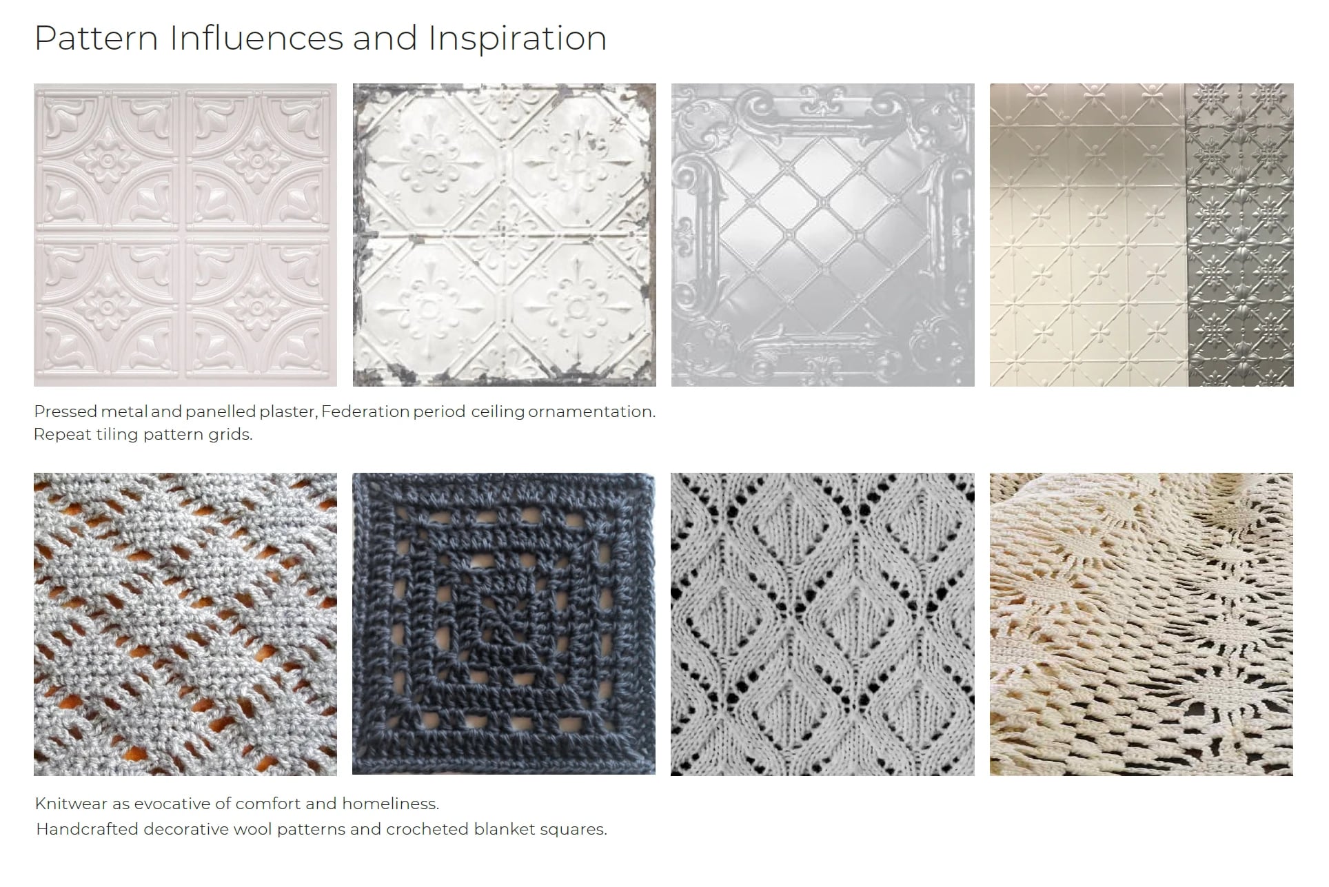
The Queenslea artwork, in Claremont, began with a simple question: what does familiarity look like? For the generation moving into this building, the answer lives in the crafted surfaces of the homes of their earlier years. Pressed metal ceilings in Federation houses. The diamond lattices of decorative brickwork. Crocheted blanket squares and the textures of handmade things. These are patterns that carry memory in them, familiar before they are decorative.
Rather than asking residents to adapt to a new and neutral place, the artwork brings the textures of remembered places to them. Comfort, offered as a material quality rather than a word.
The words before the pattern
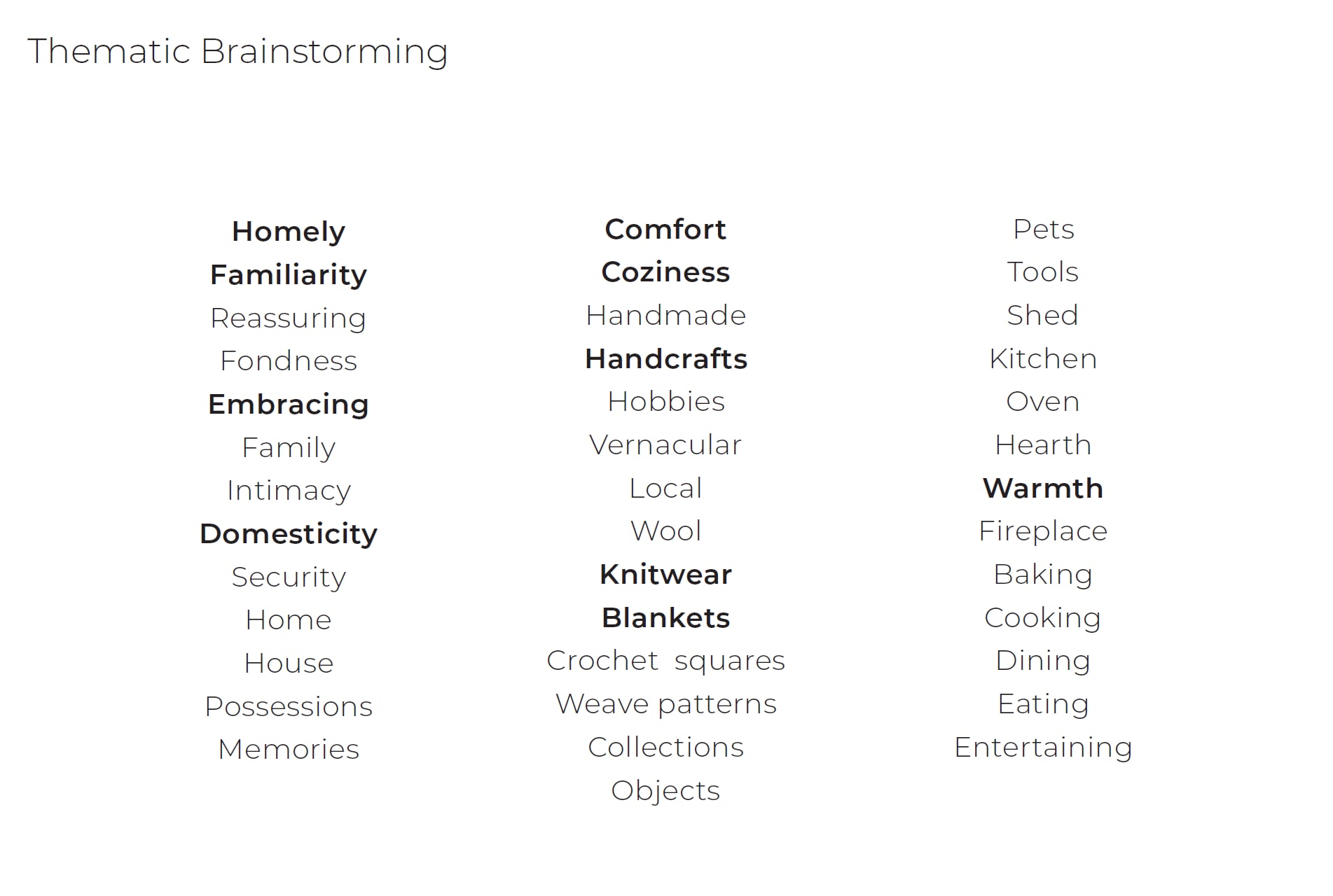
The concept began as a page of words, not a drawing. The first column was about feeling: homely, familiarity, reassuring, fondness, embracing, family, intimacy, domesticity, security, home, house, possessions, memories. The second was about making: comfort, cosiness, handmade, handcrafts, hobbies, vernacular, local, wool, knitwear, blankets, crochet squares, weave patterns, collections, objects. The third was the house itself: pets, tools, shed, kitchen, oven, hearth, warmth, fireplace, baking, cooking, dining, eating, entertaining.
Read down those columns and a design brief writes itself. Not a subject to depict, but a temperature to hold. The building had to feel, from the footpath, the way those words feel.
Where the diamond came from
Two families of pattern were gathered from that list. The first was the ceiling: pressed metal and panelled plaster from Federation period houses, the ornament that hung above a generation's kitchens and front rooms, laid out on repeating tiled grids. The second was the blanket: handcrafted wool, crocheted squares, lace and knit textures, the things made by hand for warmth and kept for decades.
The two families turned out to share a geometry. The lattice of a pressed metal ceiling and the lattice of a crocheted square are both diamonds, one stamped in tin, the other looped in wool. That shared diamond became the motif for both parts of the work, which is why a single pattern can read as masonry from the street and as a blanket up close. It belongs to both memories at once.
Two artworks, two distances
The work is in two parts, tuned to two viewing distances.
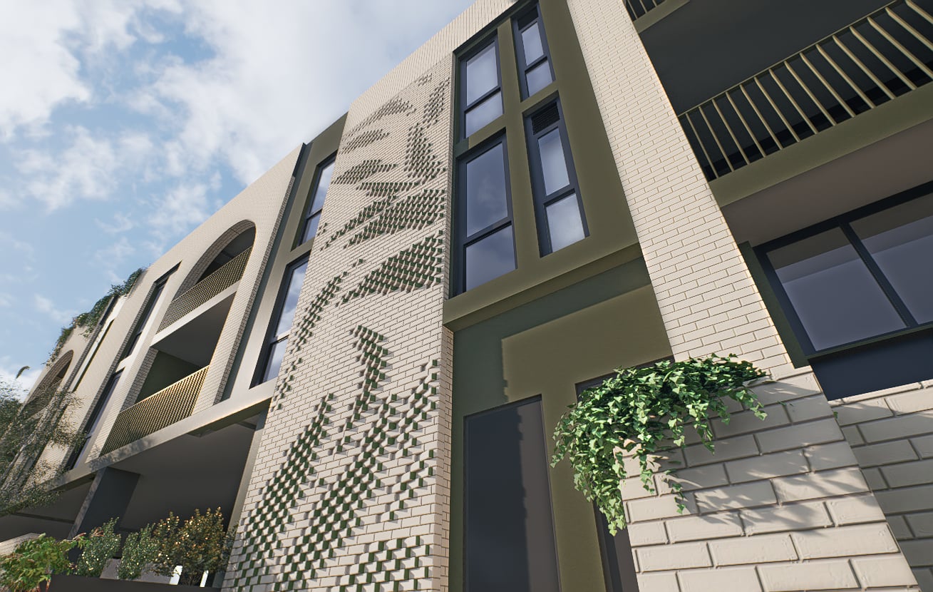
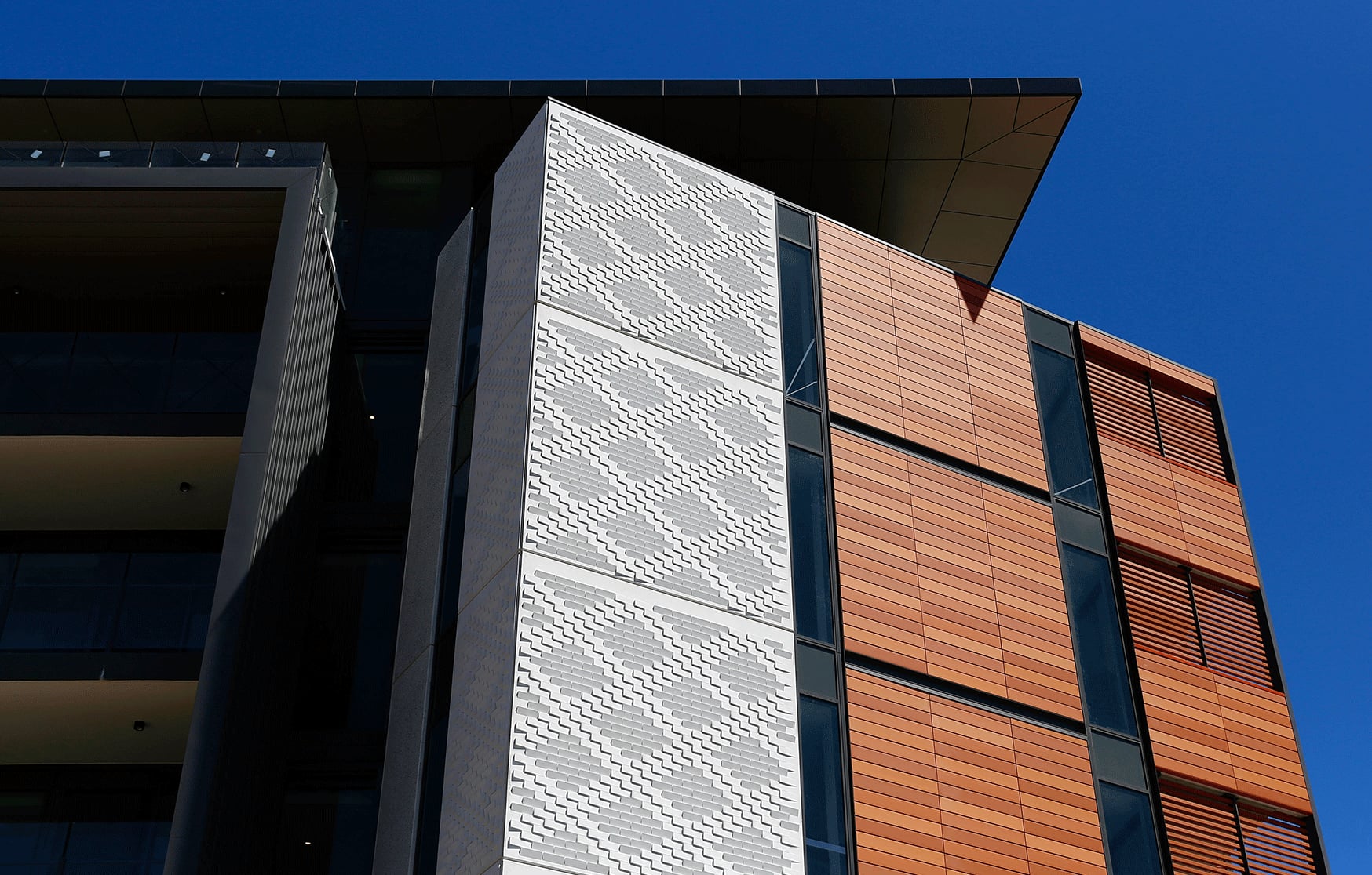
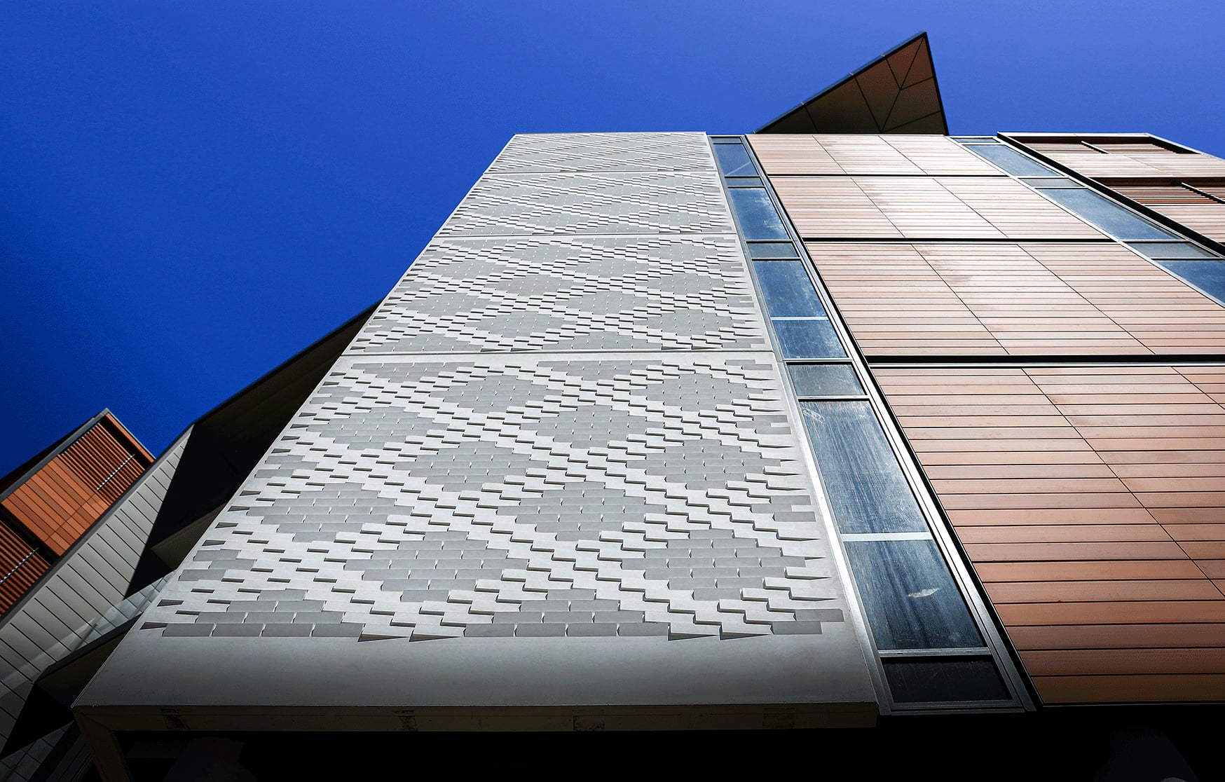
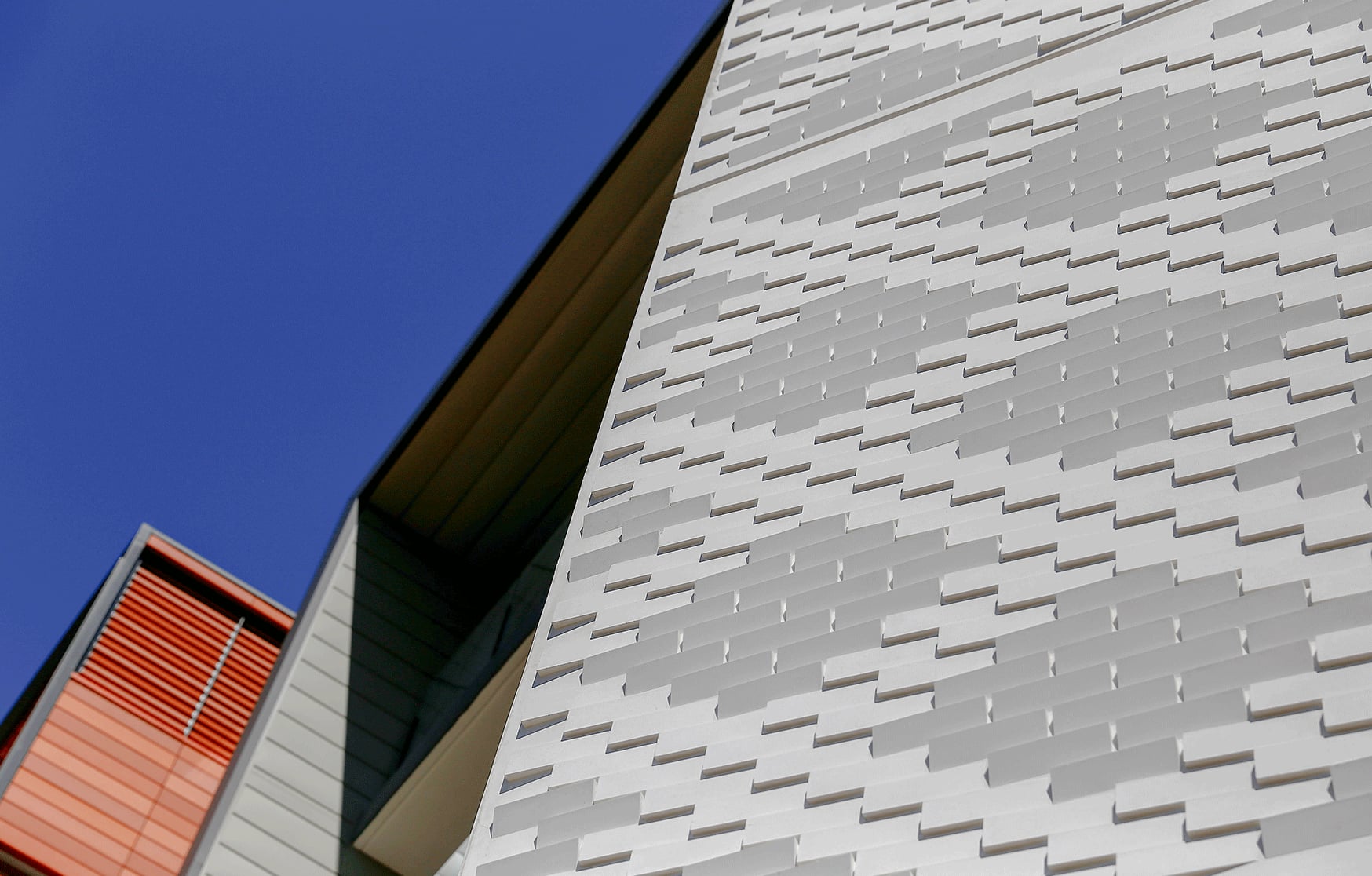
The upper facade is cast into the building itself. Sixteen precast concrete panels carry a brick-like relief in a diamond crisscross pattern, made with four reusable formliners in the moulds, so the whole of the upper storeys carries the pattern for the price of four. From the street it reads as patterned masonry; as the sun moves, the relief catches and releases shadow, so the pattern deepens, fades and returns across the day.
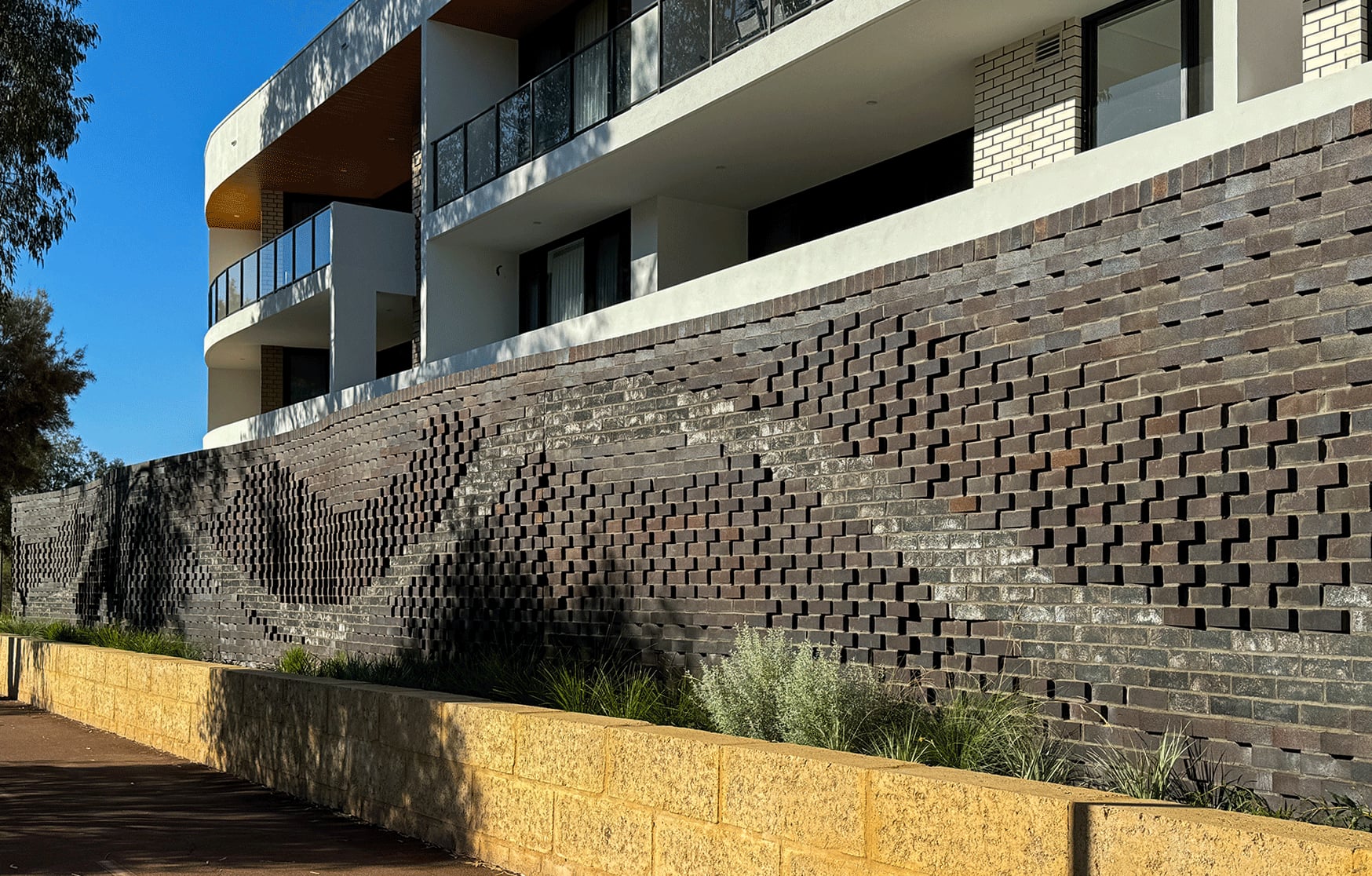
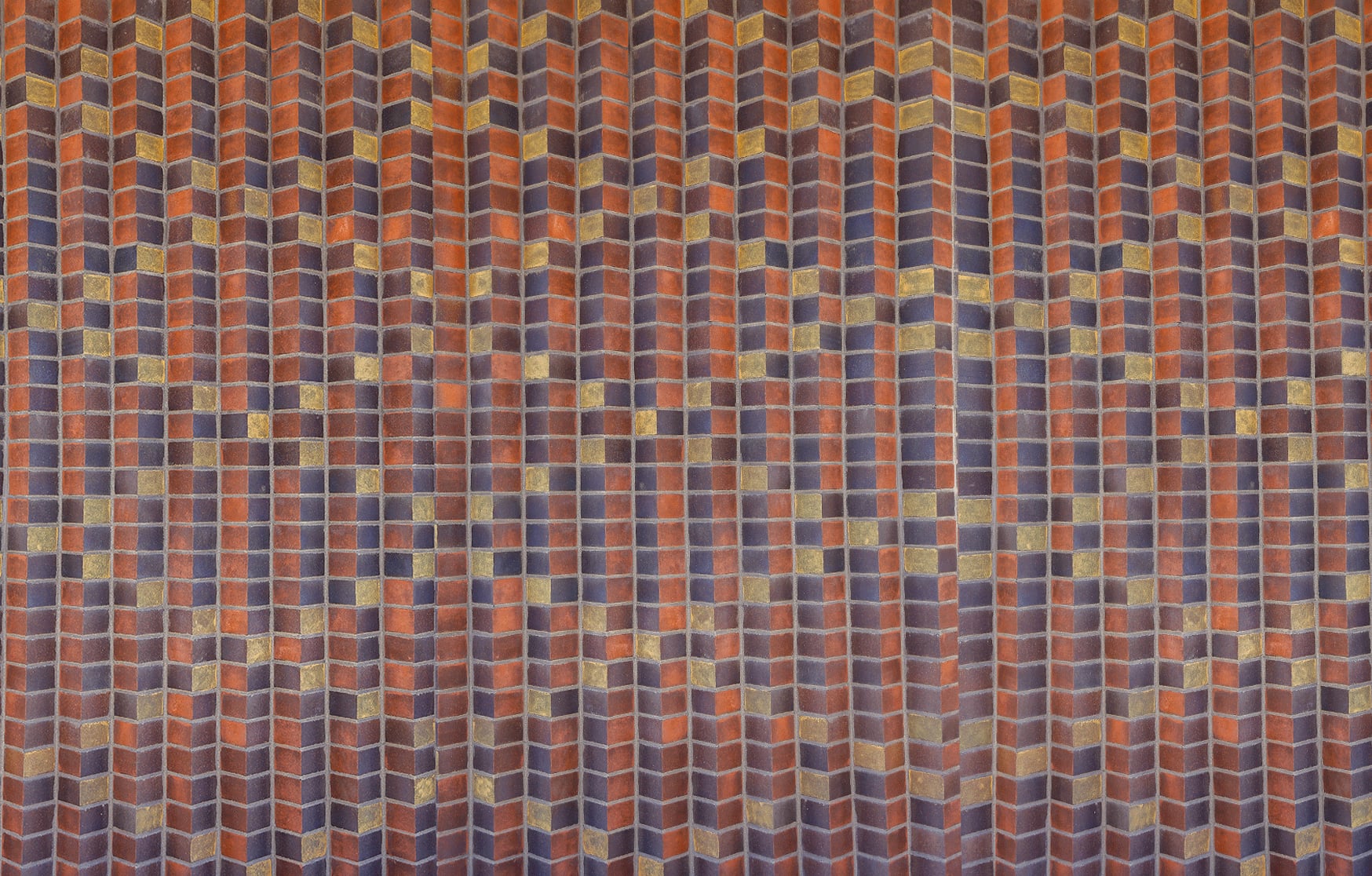
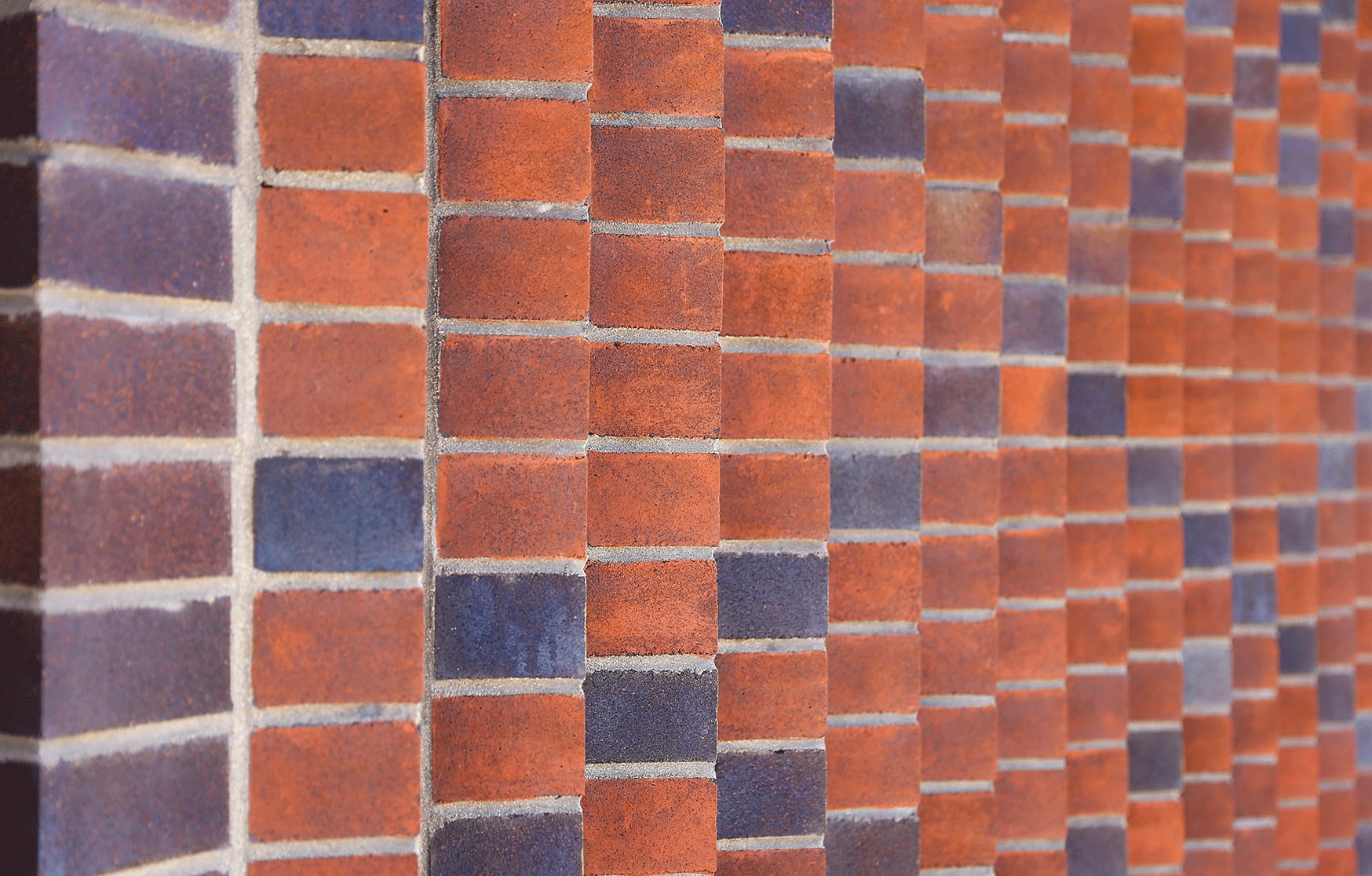
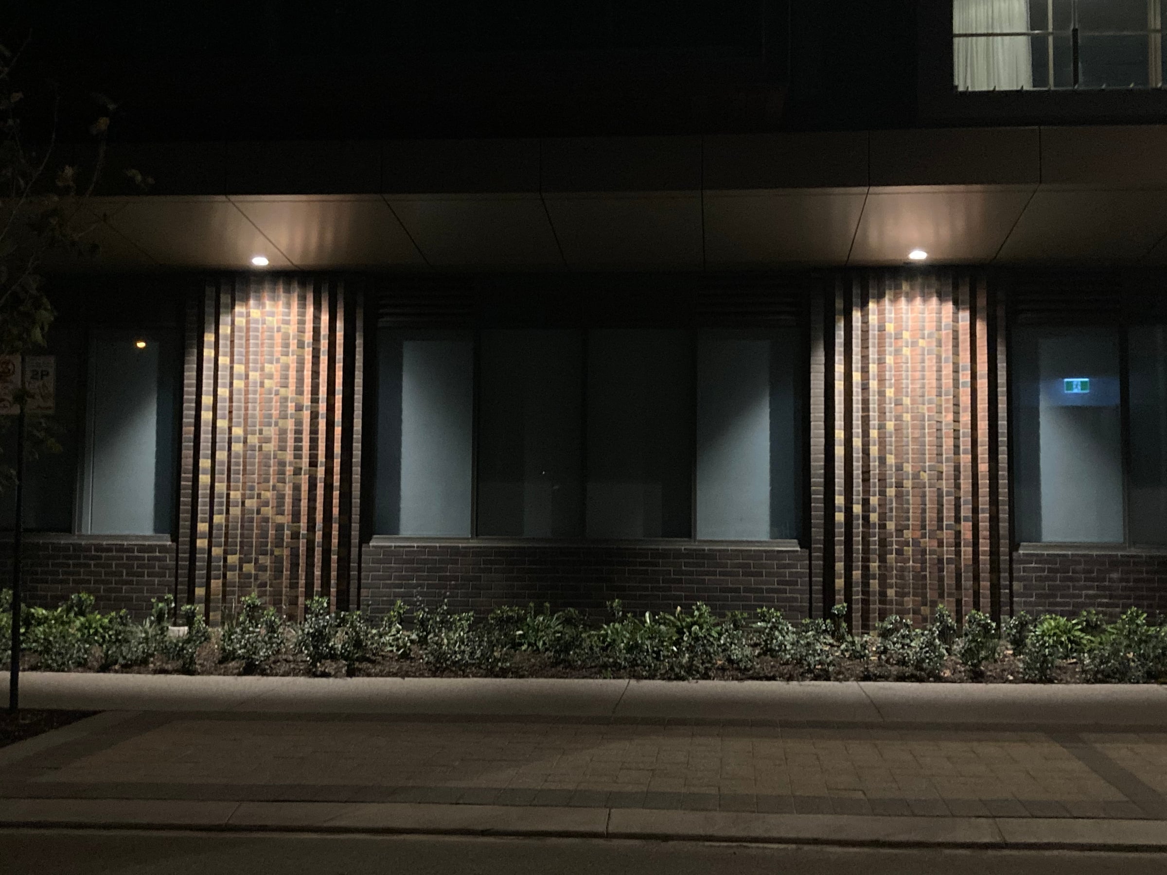
At ground level, where residents walk daily, the work plays a quieter trick. The lower brick walls, around 4,500 bricks of them, are laid with each brick angled in a V shaped pattern, and a penetrating stain is applied directionally across the folded surface. The result is a lenticular effect: from one direction the wall holds one tone, from the other direction another, and the two readings slide into each other as you walk past. Nothing moves, yet the wall is never still. It is kinetic art at walking pace, for a place where walks are daily rituals.
Why subtlety is the point
An artwork for an aged care community should not announce itself. It should work the way home works: through familiarity, texture and quiet variation. The diamond of a crocheted square meets the diamond of a garden wall; the patterns hold steady while the light keeps changing.
That restraint is also a kindness to the people who live here. A wall that shouts is tiring to pass every day. A wall that rewards a second look, and a different look on the way back, gives a daily walk something to notice without demanding anything. The work was designed to be lived beside for years, not visited once.
There is a practical lesson inside the gentle one. Casting the pattern into precast panels delivers brick scale ornament within a standard precast budget and construction method, and stained brickwork is as maintainable as any brick wall. Both parts of the work were built by the building's own trades as part of its facade, an approach the earlier post on what integrated public art actually means sets out in detail. The most sensitive brief in the portfolio also produced some of its most cost effective art per square metre. Tenderness and pragmatism turn out to be compatible.
The wider point for commissioners
Every site has an audience, and the audience should shape the reference set. Queenslea's patterns were chosen for what its residents would recognise, not for what photographs well in a design magazine. That is a transferable principle: before asking what an artwork should look like, ask who will live with it, and what they already love.
Queenslea was commissioned by Oryx Communities and completed in 2020. Artwork by Daniel Giuffre and Rick Vermey, with Hassell as architects. See the full project, or get in touch about a building with people to remember.